Femina. hr – from the Latin word “femina” – woman, is a media project (web portal with accompanying channels on social media) dedicated to a female readership with women’s topic.
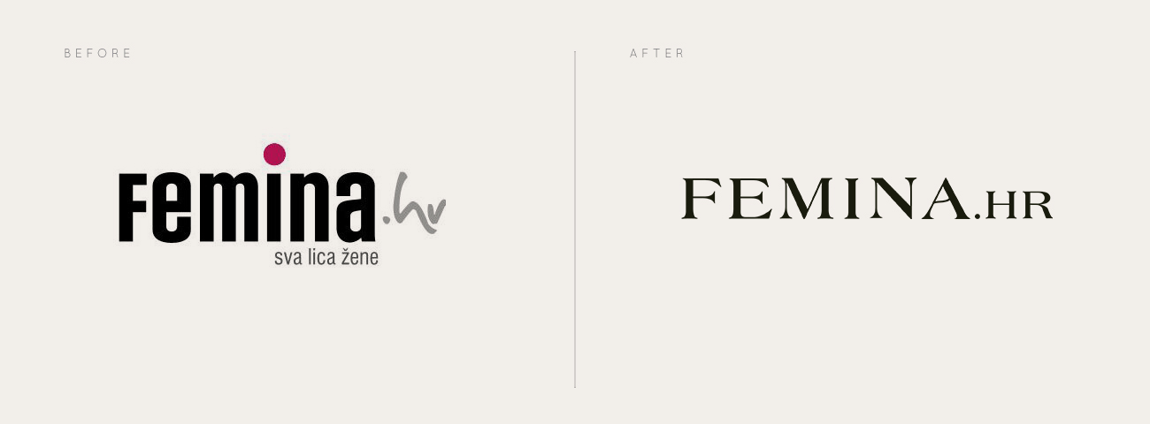
The previous logo for Femina.hr featured a bold, rounded sans-serif typeface that gave off a casual and accessible vibe. The lowercase letters, combined with the playful magenta dot above the “i”, suggested a friendly, informal tone. The “.hr” element was handwritten softening the brand’s presence. The tagline “sva lica žene” (“all the faces of a woman”) positioned the platform as diverse and inclusive, though visually it competed with the main logotype and added to the complexity. While the previous design captured a friendly and approachable vibe, it lacked the refinement and consistency needed to convey a strong and elevated brand identity.
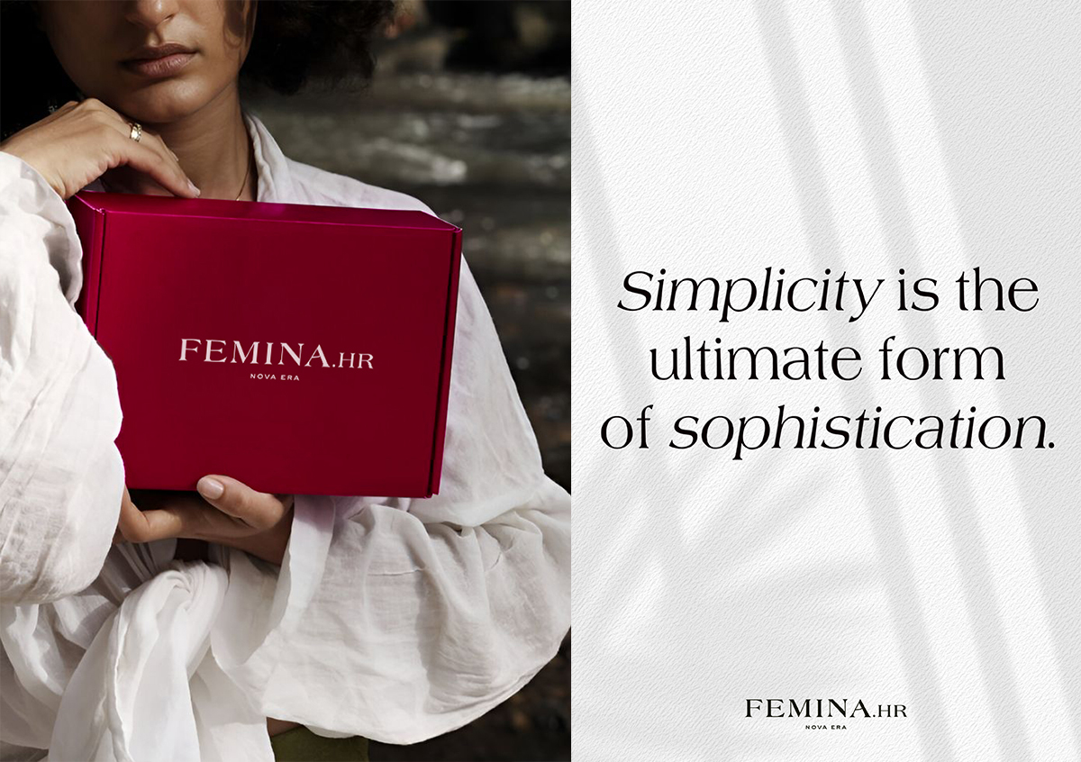
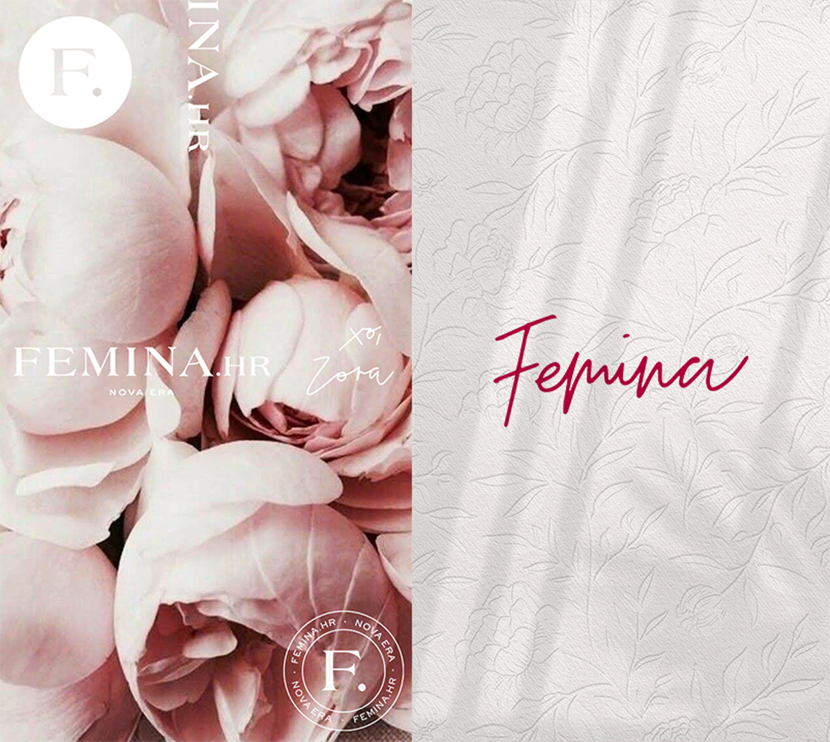
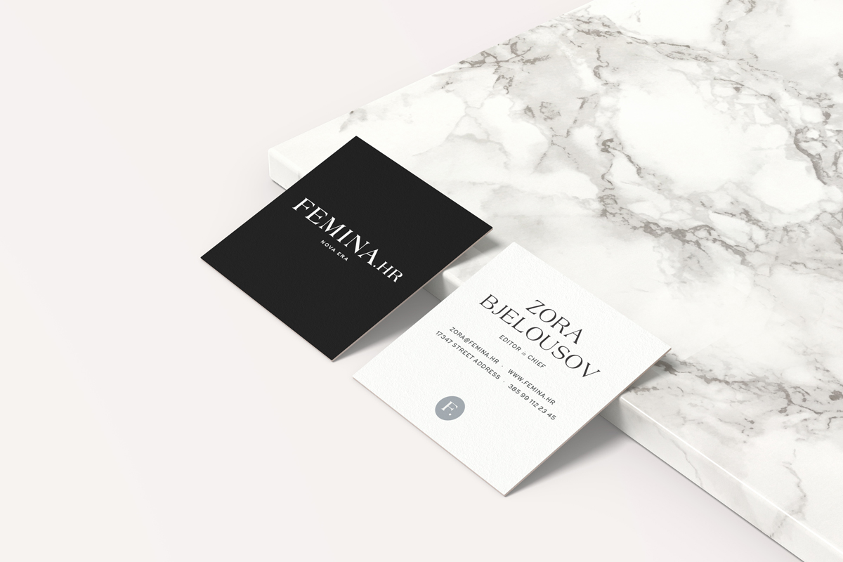
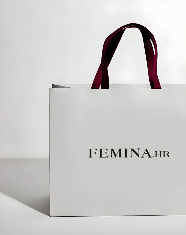
The new logo marks a clear evolution — both in tone and visual language. We wanted with the capitalization of FEMINA.HR give the brand a more timeless and editorial feel, aligning it with the aesthetics of premium fashion magazines or lifestyle platforms. By removing the color accents and tagline, the new identity embraces simplicity — allowing the brand to appear more confident and premium. This transformation signals a clear shift in tone: from casual and playful to a more sophisticated and elevated presence. It suggests that Femina.hr has grown into a more curated, content-driven platform — one that values aesthetics, credibility, and design precision.
